
A quick digital painting study based on the streets of Rabat, Morocco. Painted in Adobe Fresco using a limited brush set and a limited palette.
#AdobeFresco #UrbanPainting #DigitalPainting #Rabat #Morocco #SimonLocheArt

A quick digital painting study based on the streets of Rabat, Morocco. Painted in Adobe Fresco using a limited brush set and a limited palette.
#AdobeFresco #UrbanPainting #DigitalPainting #Rabat #Morocco #SimonLocheArt
.jpg)
This one's been sitting in the archives for a while. I don't think I ever posted it here.
#Sketchbook #ThrowbackArt #SimonLocheArt

A layoff hits hard. Whether you saw it coming or not, it can shake your sense of self.
You’re not just losing a paycheck, you’re losing teammates, routines, and creative flow.
Give yourself space to feel. Talk to people who understand. Then put a short time limit on the emotional spiral. Even two days of rest can make a big difference.
You need your energy for what’s next.
Reach out. A short message to trusted colleagues or mentors goes a long way. Let them know what happened and that you’re open to future opportunities.
You don’t need a perfect pitch. Just be real.
Here’s a simple message you can send:
“Hey, I just wanted to share that I was part of the recent layoffs at [Company]. I’m taking a moment to breathe, then starting to look ahead. If anything comes up that feels like a good fit, I’d love to hear from you.”
Don’t try to rebuild your whole career in one night. Start with your best 5 pieces. Add a short caption for each: What was the goal? What was your role? What problem did you solve?
If you need more time, consider making a private link to share with recruiters now and polishing it later.
Related article: Video Games Industry: How to Get Hired as a Concept Artist
People will ask, “What happened?”
You should keep it simple and neutral:
“There were company-wide layoffs, and unfortunately my role was affected.”
You don’t owe anyone the internal drama. Stay focused on where you want to go, not on what went wrong.
It’s easy to fall into panic mode and spend 10 hours a day on job boards. Please don’t. Overwhelming yourself won’t speed things up; it’ll just drain you.
Set a light, realistic pace:
1 hour: Apply to 1 job
1 hour: Personal project or study
30 min: Reach out to 1 or 2 contacts
Then stop. Reconnect with your family. Call a friend. Take a walk. Rest. This is also a chance to reset.
Ask yourself:
Do I still like the kind of work I was doing?
What do I want more (or less) of?
Is now the time to start that personal project I’ve been putting off?
Layoffs can create space. Protect that space and use it with care.
If your job was your main creative outlet, you may feel a void.
Try anchoring yourself in a personal project, sketch study, or idea you’ve shelved for years. No pressure to monetize it. This isn’t about proving your worth; it’s about staying connected to what makes you feel like an artist.
Aaaannd... Maybe this is the moment. The one where you finally start building your own game. Or draw that comic book you’ve carried in your head for years.
You don’t need to make it perfect. You just need to begin. Personal projects give structure and meaning when everything else feels uncertain. They remind you why you started this path in the first place.
... And who knows, what begins as therapy might grow into your next opportunity.
It’s easy to spiral into “Maybe I’m not good enough” or "That's maybe the end of my career in the industry". But that’s just your fear voice trying to feel in control.
Replace it with:
“This is a hard moment. I’m allowed to feel it. But I’m still an artist. I’m still building.”
Your identity isn’t tied to a company name.
You can post publicly about your layoff, but keep it clean and forward-looking. Avoid venting. This is usually not well received by recruiters.
Try something like this instead:
“Today, I join many talented teammates in being affected by layoffs at [Company]. I’m proud of what we built and grateful for the people I worked with. I’m now open to new roles in [discipline], and excited to keep growing.”
It positions you as professional, not bitter.
Full-time roles may take time. Freelancing can keep your skills active and your name in circulation. You don’t have to go all-in; one short contract or remote gig can rebuild momentum and help pay the bills.
Try posting availability on ArtStation, LinkedIn, or Discord communities. Let your network know what kind of work you’re open to. Be specific and focused.
Now may be the time to ask for help. Reach out to someone whose work you respect and ask for a brief chat or a review of their portfolio.
You don’t need to know what you’re asking for perfectly, just say you’re looking for honest feedback or career advice. You might discover gaps you can work on, or even new directions to grow into.
For job seekers in games, Amir Satvat’s website is one of the most practical and generous resources out there, updated job boards, mentorship, and real tools to get back on your feet.
Mentorship can shift your mindset from “What now?” to “What’s possible?”

The industry is currently experiencing a challenging period. But talent, care, and craft still matter. Stay in touch with what makes you proud to do this work, and keep showing up, even if quietly.
You’re not back at square one. You’re just in the pause between chapters.
#GameIndustry #GameDev #LayoffSupport #ConceptArt #ArtCareer #DevLife #CareerTips #SurvivalGuide #ArtistSupport #GamesArt #LevelUp #VideoGameIndustry #PortfolioTips #CreativeResilience

The recent layoffs at Microsoft alongside Xbox, Activision Blizzard, and King were personal for me. Like others in my field, I’ve experienced a cocktail of sadness and frustration. These weren’t simply headlines. They were friends, former colleagues, and people I admired.
Although I am fortunate to still be working in a role I care about, it’s difficult to remain unaffected knowing how many talented and dedicated individuals are now jobless. Some of them spent years crafting game designs, mentoring, and developing complex systems and pipelines which, while unnoticed by the majority of gamers, were essential.
I doubt this will be the last round of layoffs, as it’s the first of many we’ve encountered recently. Each attempt at restructuring reduces the amount of order and reliability that we attempt to accumulate. It also makes us examine in greater detail the ways in which the industry values people, what type of leadership is required, and how we analyze meaningful outcomes.
Most of the effort put in by developers and artists goes unrecognized. Every project has its share of decisions and sacrifices that accelerate progress, and in the case of a game, a game that is far deeper than what the final product goes far deeper than what the final product reveals. In every game, there’s many pieces of work that are missed, thus remaining unpaid, and most of them are and most of them are a requirement.
If you’re in a hiring position, or know someone who is, I hope you’ll look seriously at the many talented individuals now looking for new opportunities. Their value doesn’t disappear because of a restructuring decision. If anything, their resilience and perspective are more vital than ever.
To those affected: I admire the contributions you’ve made. I’m hopeful that your next chapter brings you not only stability, but a place where your talents are truly seen.
And to those still standing: let’s support one another. Share portfolios. Make referrals. Push for transparency and empathy where we can.
Because this industry doesn’t thrive on tech alone. It thrives on people.
#GameIndustry #MicrosoftLayoffs #GameArt #GameDevCommunity #SupportArtists #SimonLocheArt

… I disagree.
In my experience, the real challenge is helping the team believe in a shared vision, and in themselves.
Inviting your team to actively contribute to the art direction fosters both trust and a shared sense of clarity.
Anyone can point at a moodboard and say, “Let’s make it look like this.” But building visual coherence in a game is less about aesthetic preference and more about alignment, communication, and trust.
Here’s what I’ve learned after years leading diverse art teams:
▶︎ Taste doesn’t scale, trust does. Your personal eye matters, but empowering others to solve creatively within a direction is what makes teams strong.
▶︎ Clarity beats control. A great direction gives artists room to explore confidently, without second-guessing. Micromanagement kills both speed and spirit.
▶︎ Consistency is co-authored. Art direction isn’t about having the final word. It’s about shaping the first one clearly enough that others can build on it.
The best work I’ve seen didn’t come from enforcing taste, it came from shared ownership.
As an art director, your job isn’t just to see the picture. It’s to help others see themselves in it.
#ArtDirection #GameDevLeadership #ConceptArt #CreativeTeams #TrustOverTaste #GameArtTips

#InkDrawing #DigitalSketch #Rebelle7 #PortraitStudy #Brushwork #SimonLocheArt
Whether you're a beginner building fundamentals or a seasoned artist refining your craft, the right books can become lifelong companions.
This list includes some of the best art training books out there, full of practical exercises, brilliant teaching, and deep visual insight.

This is a must-have for understanding visual storytelling and composition. It breaks down how to create mood, movement, and clarity in sequential images. Marcos walks you through examples using cinematic lighting, silhouettes, and compositional flow, making this book invaluable for both comic artists and concept designers.

A powerful continuation of the first volume, Framed Ink 2 focuses on advanced narrative techniques, staging, and visual empathy. It explores how to build tension, emotion, and rhythm visually, essential concepts for those working in story-driven media like games, film, or animation.

A visually rich and clearly written book focused on how light interacts with form and how to use color intentionally. Charlie Pickard breaks down key concepts like atmospheric perspective, lighting direction, and hue shifts. Perfect for digital painters who want to improve lighting and storytelling.

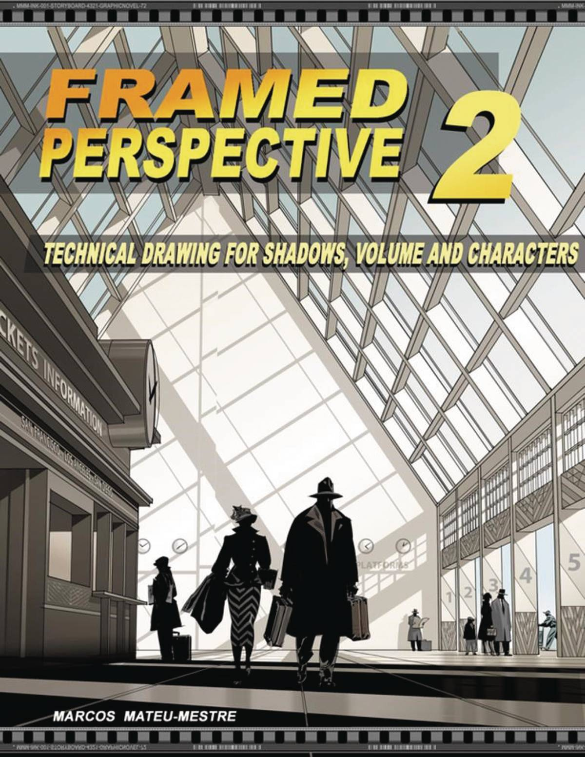
These two volumes go deep into the mechanics of perspective drawing. Volume 1 covers the essentials: 1, 2, and 3-point perspective, horizon lines, and vanishing points. Volume 2 builds on that, focusing on how perspective can be used emotionally in storytelling. These books are foundational for anyone serious about environment design and believable space.

A self-published legend. Peter Han's Dynamic Bible is a workbook filled with exercises that develop your visual library, line confidence, and design logic. With a focus on building strong drawing habits and shape design, it’s ideal for artists looking to sharpen their fundamentals and take on concept sketching or creature design.

Full of simplified and dynamic breakdowns, this book is great for learning how to exaggerate form while keeping things grounded. It covers stylized anatomy, facial expressions, and poses with a clear and playful visual language. Perfect for artists looking to inject personality into their character work.

A brilliant guide for understanding anatomy in a stylized yet structural way. Rockhe Kim explains human anatomy through a designer's lens, breaking down muscle groups into clean, readable forms. Great for character designers, figure drawing students, or anyone trying to draw believable human bodies with a stylized edge.

An elegant, in-depth guide to practical perspective for illustrators and concept artists. Dongho Kim explains how to visualize space intuitively, making this book ideal for both beginners and seasoned environment artists. Beautifully laid out and highly digestible.
.jpg)
A fresh and accessible anatomy book that connects gesture, construction, and surface anatomy. Tom Fox includes detailed studies, pose breakdowns, and insightful notes that help you understand the figure in motion. It’s a great companion for daily sketchers and character-focused artists alike.
These books aren't just pretty to flip through, they're powerful learning tools.
Whether you're leveling up your gesture drawing, mastering perspective, or understanding light and color, there's something in this list to help push your skills further.
#ArtBooks #DrawingTips #ConceptArtTraining #FundamentalsMatter #SimonLocheArt

As artists, we often get caught up in the excitement of color, detail, and brushwork. But when it comes to building a truly compelling composition, sometimes less is more. That’s where Notan comes in, a deceptively simple concept that can transform the way you design your paintings.
Notan (濃淡) is a Japanese word that translates to “light-dark.” It’s all about the relationship between positive and negative space, between areas of light and areas of dark. Think of it like the visual skeleton of your artwork. Strip away the color, the detail, even the subject, and what you’re left with is the pure structure of your composition.
Ever stare at a painting that just feels off, but you can’t quite figure out why? Or maybe you’re planning a new piece and something in the layout doesn’t feel balanced? Notan studies help you see the design clearly, without distractions.
By reducing your scene to only two or three values (usually black, white, and maybe a midtone), you can spot compositional issues early. Is the focal point clear? Are the shapes too similar in size? Is the negative space doing any heavy lifting? These are the kinds of questions Notan helps answer.
You don’t need any fancy tools to get started. You can:
Use black markers or paint on white paper
Snap a photo and simplify it digitally into black and white shapes
Sketch with just one value on your tablet
The key is to stop worrying about realism and focus on clarity, contrast, and balance between shapes.
Here’s a great tip: Try shifting your viewpoint or cropping your scene differently. Even a small change in perspective can completely transform the Notan, and in turn, the strength of your final piece.
While Notan is often taught in art schools, it’s a tool that professional artists keep coming back to. Whether you’re working in oils, watercolors, or digital, it’s a fast and effective way to test the strength of your ideas before you commit hours of work.
Adding a third value, usually a midtone, can also be helpful. This allows for more nuance and helps guide decisions about lighting and depth later on in your painting.
Think of Notan like stretching before a workout. It doesn’t take long, but it sets the stage for everything that follows. Try making it a part of your process. Do quick studies before starting a new piece. Use them to test thumbnails or resolve tricky compositions.
You’ll be amazed at how much it sharpens your design instincts and how it helps you see your own work with fresh eyes.

In a world full of noise and color, Notan brings you back to the essentials. It’s a reminder that great art starts with great design. Light and dark. Positive and negative. Simplicity with purpose.
So the next time you’re stuck, grab a pen or open a new canvas, and block in the big shapes. Sometimes, all it takes is two values to bring clarity and power to your vision.
Tools to help you organise values:
- Photoshop
- Proko Value Tool
Related Articles:
Leg Day for Artists: Why Focusing on One Skill at a Time Builds Real Strength
Quick digital paint. 3 values study
#Notan #ArtComposition #VisualDesign #ArtistTips #ArtStudy #CreativeProcess #PaintingTips #DesignThinking #ValueStudy #ArtEducation #MakeArtDaily #SketchSmart #ArtFundamentals #DigitalPainting #TraditionalArt #SimonLocheArt

As artists, we constantly talk about the importance of values, and for good reason.
Value structure (the contrast between lights and darks) is one of the most powerful tools for readability, composition, and mood. But seeing values clearly isn't always easy, especially when working in color.
That’s where See Value comes in. This small but brilliant app does one thing, and does it extremely well: it helps you see the values in your reference or artwork instantly.


See Value is a mobile app that overlays a value filter over your camera or photo gallery. You can use it in real time or on imported images to instantly understand the light/dark relationships in your reference.
It’s perfect for:
Studying photo references
Capturing plein air scenes with better value awareness
Checking your own digital or traditional work for value grouping issues
Understanding why something feels "off" in a painting
In digital painting software, it’s easy to toggle a grayscale filter. But when you're out in the world, or working traditionally, that option vanishes.
See Value brings that tool into the physical world, letting you:
Instantly check value balance in real scenes or photos
Train your eye to group values more effectively
Compare different references quickly without second-guessing
I often use See Value when scouting references or setting up a sketch from life. A quick check through the app tells me what to emphasize, what to simplify, and where my focal areas could land. It’s especially helpful when the lighting is soft or complex.
It’s also a great tool to show students when explaining why certain areas of a composition work or don’t.
See Value is a tiny tool with a big impact. It won’t make your painting for you, but it will train your eye and boost your awareness of one of the most foundational aspects of visual storytelling.
Highly recommended for any artist who wants to improve their value structure, whether you're painting, drawing, or simply observing.
See Value in the app store (FREE): https://apps.apple.com/in/app/see-value/id1312532225

#SeeValue #ArtTools #ValueStudy #ArtProcess #VisualClarity #SimonLocheArt

That ambition is good, but it can also be what holds you back.
Think of it like training at the gym. You wouldn’t try to do leg day, chest day, cardio, and flexibility all at the same time. You isolate. You focus. You build strength, one area at a time.
The same applies to your art practice.
Trying to improve everything at once usually leads to frustration and burnout. Instead, isolate one aspect of your craft, and dedicate a session or even a full week to it.
Want to improve your composition?
Grab a marker or a single soft pencil.
Set a timer for 10-15 minutes.
Fill a page with thumbnails. Don't worry about detail or finish, just focus on flow, balance, and rhythm.

Want to improve color composition?
Trace a portrait or photo, if you need a quick composition (yes, tracing is fine when you're focusing on something else).
Then dive into color. Focus on getting the temperature, harmony, and contrast right.
Ignore rendering. Ignore linework. Just push paint around.
 Here, I just grabbed my iPad and directly painted with colors, not caring about accuracy
Want to sharpen your anatomy?
Do 30-second gesture drawings with a timer.
Spend a whole sketch session just drawing hands. Or shoulders. Or feet.

Want to get better at lighting?
Take a simple bust model or head sketch and draw it under five different lighting scenarios.
Stick to grayscale. Don't distract yourself with color.

Want to work on materials and surfaces?
Paint studies of just metal. Then just skin. Then just fabric.
Don't worry about the character. You're just learning how each material reacts to light.
Focusing on a single area forces you to solve problems more deeply. It removes the noise and lets you listen to the part of the process you're trying to train. Like doing slow reps at the gym, you're building muscle memory and confidence where it counts.
Even professionals train like this. Behind every "polished" piece are dozens of focused studies: hands, rocks, values, brushstrokes.
So next time you sit down to draw, ask yourself: What's today’s leg day?
#ArtPractice #FocusedTraining #ArtistTips #ConceptArt #SketchbookDiscipline #NotanStudies #SimonLocheArt

Inking is one of the most rewarding parts of the drawing process, and also one of the most unforgiving. There’s no undo, no erasing, no backtracking. But that’s what makes it powerful. Ink rewards bold decisions, controlled rhythm, and a sensitivity to surface and stroke.
Here are a few essential ink drawing tips to help you build more confidence, clarity, and expression in your work:
1. Vary Your Line Weight
Think of line weight as a way to guide the viewer’s eye. Use thicker lines to emphasize structure, form, and objects in the foreground. Use thinner lines for detail, texture, and elements that are farther away.
The contrast between thick and thin adds visual interest and helps separate planes, even without any shading.
2. Use Your Whole Arm, Not Just Your Wrist
For long, flowing strokes, engage your shoulder and elbow, not just your wrist. This gives you smoother curves and more confident lines. Before starting a drawing, warm up with quick, loose gestures, 10 big curves or ellipses with no stopping.
The more you move your arm, the more energy and fluidity your lines will have.
3. Let the Paper Add Texture
Don’t fight your surface. Work with the texture of the paper by varying the pressure of your strokes. Let the brush or pen skip and break a little, especially for rough textures, shadows, or organic surfaces. These subtle imperfections add character.
A heavy press gives you solid blacks. A lighter touch lets the paper show through, giving your work atmosphere and grit.
4. Embrace Imperfection
Ink is about decision-making, not perfection. If a line wobbles or breaks unexpectedly, use it. Fold it into the drawing. Sometimes the best part of an ink drawing is the mistake you didn’t try to fix.
5. Commit to the Line
Hesitation shows. Commit to each stroke with purpose, even if it’s not 100% right. Confident lines, even if slightly off, are often more appealing than over-cautious ones.
If unsure, lightly pencil your structure first, then ink with clarity.
Inking isn’t just about control; it’s about rhythm, sensitivity, and letting go of perfectionism. Like all skills, it comes with mileage. So grab your favorite brush pen, turn off the pressure to be perfect, and let the ink flow.
#InkDrawing #DrawingTips #LineWeight #BrushControl #TraditionalArt #SimonLocheArt


Understanding the reality of concept art helps both aspiring artists and curious outsiders appreciate the depth of the discipline. It’s not just art, it’s design, communication, and collaboration in motion. Debunking these myths brings us closer to seeing concept artists for what they really are: visual problem solvers working at the heart of production.
#ConceptArt #GameArt #ArtIndustry #VisualDevelopment #DigitalArt #ArtCareer #ConceptArtistLife #ArtEducation #CreativeProcess #SketchbookWork #SimonLocheArt

Yesterday, all across parts of Spain, there was a massive power outage. No lights, no internet, no screens, and certainly no Photoshop.
It got me thinking… we often talk about survival kits, flashlights, water, battery packs, but what about an artist’s survival kit? What would you need to keep creating without electricity, without tablets, and without digital tools? I rely personally a lot on new technology, and I often need to force myself to reconnect to traditional tools.
Are we still artists if our creativity depends entirely on specific tools, or does artistry stop where our tools can no longer carry us?
Let’s face it, we’ve ALL become a bit too dependent on chargers and undo buttons.
SO... here’s a fun little list of what I’d pack in my offline, post-apocalyptic, no-WiFi, artist survival kit:
Not one mechanical pencil that runs out of lead in five minutes. I’m talking real, solid graphite. 2B, 4B, 6B, and a lot of colored pencils, give me a full range, and I’m good. Bonus points for a pencil sharpener you don’t need a USB port for.
Microns, brush pens, and a good old fountain pen if you’re feeling fancy. Ink sketching without Ctrl+Z is a humbling experience, but that’s what makes it worth doing.
One that doesn’t fall apart in the rain and doesn’t smudge every time your wrist touches the page. Spiral, hardcover, softcover, it doesn’t matter as long as you like the paper and it’s ready when inspiration (or boredom) strikes.
If you’ve ever painted by candlelight, you know it’s both magical and mildly impractical. But having a tiny travel gouache or watercolor kit and a brush with a refillable water tank? Game changer.
Sketch, ink, shade, paint, and brush pens are the multitool of the traditional art world. Add a few to your kit and you’re ready for pretty much anything.
Because, as romantic as it sounds, drawing in total darkness is less inspiring than you’d think.
The truth is, being “offline” can be a gift. No distractions. No scrolling. Just you, your tools, and your ideas. That’s a creative reset we all need once in a while.
 A picture of a random page in my sketchbook.
The blackout might have been annoying (okay, it was annoying), but it was also a good reminder: you don’t need fancy software or a digital setup to make art. Just some basic tools and a brain that likes to ask “what if?”
So next time the lights go out, maybe don’t panic. Maybe open a sketchbook instead.
You never know, your best idea might show up when the WiFi doesn’t.
But here’s the real takeaway: don’t wait for a power outage to unplug.
There’s something grounding about returning to traditional tools now and then. No layers. No shortcuts. No infinite undos. Just you, the page, and the marks you choose to make.
Even in a digital world, it’s worth reminding ourselves that creativity doesn’t depend on electricity. Reconnecting with traditional media sharpens your instincts, clears your head, and reminds you why you started drawing in the first place.
So next time the lights go out, maybe don’t panic. Maybe open a sketchbook instead.
You never know... your best ideas might show up when the WiFi doesn’t.
#AnalogArt #ArtSurvivalKit #NoPowerNoProblem #SketchbookLife #SpainPowerOutage #ApagonEspaña #SimonLocheArt

This piece is a quick three-value study I painted using Adobe Fresco. The goal was simple: focus purely on shape, contrast, and atmosphere without letting details take over.
Working with only three values, light, midtone, and dark, forces you to make clear decisions about composition and structure. It’s an exercise I keep coming back to because it sharpens the fundamentals that every painting relies on, no matter how complex the final result might be.
It’s always worth taking a step back and reconnecting with the basics. I’ll definitely be doing more of these.
And if you want to see another 3 values study I made, just follow this link:
https://simonloche.blogspot.com/2025/02/quick-digital-paint-3-values-study.html

In the world of concept art, much like in the way of the samurai, success does not come through raw talent alone. It comes from discipline, preparation, and the careful sharpening of one’s tools over time.
A concept artist is a visual warrior. Each project is a new battleground, and the tools you carry must be ready, reliable, and refined. The wrong tools, or worse, a lack of mastery over them, can turn opportunity into defeat.
Here is a guide to the essential weapons every concept artist should master and carry into their daily practice.
A samurai would never enter battle without a blade tuned to their hand. Similarly, a concept artist must be at ease with their tablet. Whether it’s a screen-based tool like the Cintiq or a classic pen tablet like the Intuos, your connection to the canvas must be fluid and precise.
Photoshop remains the katana of digital painting: sharp, versatile, and adaptable to nearly any situation. From quick sketches to matte paintings to final concept renders, mastery of Photoshop is non-negotiable for a serious concept artist and a go-to standard in the industry.
For those who favor the elegance of ink and the strength of line, Clip Studio Paint offers the perfect balance. Its sensitivity to pressure, brushwork, and its stability make it a favorite for artists who value precision and gesture.
Even a master swordsman studies the structure of his opponents. Blender allows concept artists to quickly build blockouts, establish lighting references, and set foundations for complex environments. A flexible 3D tool, and free, it offers endless opportunities for those willing to learn its techniques. And it's FREE!
When the need arises for intricate armor, elaborate creatures, or realistic surfaces, ZBrush is the tool of choice. It demands focus but rewards perseverance with a level of detail and form that few other tools can match.
A warrior’s mind is sharpened by study, and PureRef is the perfect library. It lets you gather and organize your references, your maps, your inspirations, without breaking the flow of battle. Clean, efficient, and always close at hand.
The color wheel is the artist’s sense of timing and balance. Coolorus, a Photoshop plugin, makes choosing hues, values, and harmonies feel instinctive. A far more intuitive tool than the default picker, it helps sharpen color decisions quickly under pressure.
--> Why Coolorus Is One of the Best Photoshop Plugins for Artists
Sometimes, agility matters more than heavy armor. Procreate and Infinite Painter offer speed and portability, perfect for on-the-go sketching, fast ideation, and warming up before bigger battles.
A wise warrior studies the landscapes before marching. Tools like Instant Street View and MapCrunch provide access to countless real-world references for environments, lighting, and atmosphere, essential for building believable worlds.
--> Using MapCrunch and Instant Street View for Landscape and Environment Painting Inspiration
For when precision in materials and surfaces becomes necessary, Substance Painter offers real-time painting directly onto 3D assets. It sharpens a concept artist’s understanding of texture, light interaction, and realism.
Even in a digital age, the old ways endure. A simple sketchbook, pencil, or brush sharpens the hand and eye like no screen ever could. Fast studies, loose thumbnails, and spontaneous ideas find their purest form here.
--> 5 Best Sketchbooks for Artists (and Why They’re Worth Using)
A samurai’s strength lies not only in their sword but in their discipline, awareness, and adaptability.
For a concept artist, tools are no different.
You do not need every blade, but you must know the ones you choose with confidence and mastery. Invest your time wisely. Sharpen your skills with patience. And never forget: the tools exist to serve the artist’s vision, not to define it.
What weapons do you carry into your creative battles? Feel free to share your essentials.
#ConceptArt #ArtTools #Photoshop #ClipStudioPaint #Blender #ZBrush #PureRef #DigitalArt #ArtistDiscipline #SimonLocheArt

When it comes to working efficiently in Photoshop, having the right tools in place can make a huge difference. One plugin I keep coming back to, and can’t recommend enough, is Coolorus, a color wheel extension that completely changes the way you interact with color inside Photoshop.
Photoshop’s default color picker works, but it’s not exactly artist-friendly. It’s functional, but not visual. Coolorus brings in the kind of intuitive, painter-focused interface you’d expect from software like Corel Painter or Infinite Painter, making it much easier to explore, select, and manage your color palette.
Here’s why it stands out:
Coolorus uses the HVC color model (Hue, Value, Chroma), which gives you a visual layout that’s more in line with how traditional painters think about color. Instead of hunting through sliders, you can see and feel the relationships between colors instantly.
Coolorus includes built-in color harmony guides, complementary, split-complementary, analogous, triadic, and more. It makes building a balanced palette fast and intuitive, especially during early concept or layout phases.
As you paint, you can easily lock hues, preview temperature shifts, and fine-tune your tones with precision. It’s small adjustments like these that save time and allow for a more controlled color workflow.
Coolorus integrates seamlessly into your Photoshop UI. You can dock it like any other panel, set it up in your custom workspace, and access it instantly. It’s fast, responsive, and doesn’t interrupt your flow.
You can customize how the color wheel looks and behaves, change the layout, toggle RGB sliders, or lock values depending on your preference. The ability to tweak the interface means it adapts to your personal workflow, not the other way around.
If you work in Photoshop and deal with color daily, whether you’re painting, illustrating, designing, or concepting, Coolorus is absolutely worth having in your toolkit. It’s one of those quiet additions that speeds things up, makes your work more consistent, and lets you focus more on the art and less on the tools.
LINK: https://coolorus.com
Highly recommended.
#Coolorus #PhotoshopPlugin #DigitalPainting #ColorWorkflow #ArtTools #SimonLocheArt

In the era of digital painting, where sliders and color pickers do much of the heavy lifting, it’s easy to forget how color mixing actually works in traditional media.
If you’ve spent a lot of time working digitally and want to test whether your real-world color instincts are still sharp, here’s a fun little challenge:
It’s a simple but effective exercise. You’re given a target color and asked to recreate it by mixing just a few base colors, just like you would with real paint.
Apparently, I’m still in shape. I managed to hit 99% accuracy! But I still paint regularly with gouache and oil, so I guess that muscle memory is still there.
If you’re feeling a bit rusty or just want to challenge yourself, give it a try. It’s a great way to reconnect with how hues, saturation, and values behave outside of digital tools.
And if you take the test, share your screenshots. I’d love to see how others are doing!
#ColorTheory #DigitalPainting #TraditionalArt #ArtChallenge #PracticeMatters