Showing posts with label tutorial. Show all posts

Tuesday, May 20, 2025

The Secret Power of Notan: Designing with Light and Dark

Discover how Notan studies can improve your art compositions by focusing on the balance of light and dark shapes. A must-know tool for artists!
Quick Notan Sketches Studies

As artists, we often get caught up in the excitement of color, detail, and brushwork. But when it comes to building a truly compelling composition, sometimes less is more. That’s where Notan comes in, a deceptively simple concept that can transform the way you design your paintings.

What Is Notan?

Notan (濃淡) is a Japanese word that translates to “light-dark.” It’s all about the relationship between positive and negative space, between areas of light and areas of dark. Think of it like the visual skeleton of your artwork. Strip away the color, the detail, even the subject, and what you’re left with is the pure structure of your composition.

Why It Matters

Ever stare at a painting that just feels off, but you can’t quite figure out why? Or maybe you’re planning a new piece and something in the layout doesn’t feel balanced? Notan studies help you see the design clearly, without distractions.

By reducing your scene to only two or three values (usually black, white, and maybe a midtone), you can spot compositional issues early. Is the focal point clear? Are the shapes too similar in size? Is the negative space doing any heavy lifting? These are the kinds of questions Notan helps answer.

How to Do a Notan Study

You don’t need any fancy tools to get started. You can:

  • Use black markers or paint on white paper

  • Snap a photo and simplify it digitally into black and white shapes

  • Sketch with just one value on your tablet


The key is to stop worrying about realism and focus on clarity, contrast, and balance between shapes.

Here’s a great tip: Try shifting your viewpoint or cropping your scene differently. Even a small change in perspective can completely transform the Notan, and in turn, the strength of your final piece.

Not Just for Beginners

While Notan is often taught in art schools, it’s a tool that professional artists keep coming back to. Whether you’re working in oils, watercolors, or digital, it’s a fast and effective way to test the strength of your ideas before you commit hours of work.

Adding a third value, usually a midtone, can also be helpful. This allows for more nuance and helps guide decisions about lighting and depth later on in your painting.

Make It a Habit

Think of Notan like stretching before a workout. It doesn’t take long, but it sets the stage for everything that follows. Try making it a part of your process. Do quick studies before starting a new piece. Use them to test thumbnails or resolve tricky compositions.
You’ll be amazed at how much it sharpens your design instincts and how it helps you see your own work with fresh eyes.

Discover how Notan studies can improve your art compositions by focusing on the balance of light and dark shapes. A must-know tool for artists!
Quick study made in Infinite Painter App


Final Thoughts

In a world full of noise and color, Notan brings you back to the essentials. It’s a reminder that great art starts with great design. Light and dark. Positive and negative. Simplicity with purpose.

So the next time you’re stuck, grab a pen or open a new canvas, and block in the big shapes. Sometimes, all it takes is two values to bring clarity and power to your vision.


Tools to help you organise values:
- Photoshop
- Proko Value Tool


Related Articles: 

Leg Day for Artists: Why Focusing on One Skill at a Time Builds Real Strength

Quick digital paint. 3 values study


#Notan #ArtComposition #VisualDesign #ArtistTips #ArtStudy #CreativeProcess #PaintingTips #DesignThinking #ValueStudy #ArtEducation #MakeArtDaily #SketchSmart #ArtFundamentals #DigitalPainting #TraditionalArt #SimonLocheArt


Friday, May 16, 2025

Leg Day for Artists: Why Focusing on One Skill at a Time Builds Real Strength

focused art training, how to improve art skills faster, art study techniques, isolating art fundamentals, building creative discipline, concept art exercises, how to practice drawing effectively


When you're making art, it's tempting to try and solve everything at once: composition, anatomy, values, color, storytelling, design... all packed into a single piece.

That ambition is good, but it can also be what holds you back.

Think of it like training at the gym. You wouldn’t try to do leg day, chest day, cardio, and flexibility all at the same time. You isolate. You focus. You build strength, one area at a time.

The same applies to your art practice.


Narrow Your Focus, Accelerate Your Growth

Trying to improve everything at once usually leads to frustration and burnout. Instead, isolate one aspect of your craft, and dedicate a session or even a full week to it.

Want to improve your composition?

  • Grab a marker or a single soft pencil.

  • Set a timer for 10-15 minutes.

  • Fill a page with thumbnails. Don't worry about detail or finish, just focus on flow, balance, and rhythm.

focused art training, how to improve art skills faster, art study techniques, isolating art fundamentals, building creative discipline, concept art exercises, how to practice drawing effectively
I often make this quick 1 value thumbnail to help me focus on composition. Notan Study

Want to improve color composition?

  • Trace a portrait or photo, if you need a quick composition (yes, tracing is fine when you're focusing on something else).

  • Then dive into color. Focus on getting the temperature, harmony, and contrast right.

  • Ignore rendering. Ignore linework. Just push paint around.

focused art training, how to improve art skills faster, art study techniques, isolating art fundamentals, building creative discipline, concept art exercises, how to practice drawing effectivelyHere, I just grabbed my iPad and directly painted with colors, not caring about accuracy

Want to sharpen your anatomy?

  • Do 30-second gesture drawings with a timer.

  • Spend a whole sketch session just drawing hands. Or shoulders. Or feet.

focused art training, how to improve art skills faster, art study techniques, isolating art fundamentals, building creative discipline, concept art exercises, how to practice drawing effectively
Studying masters for anatomy is a good idea as they have already solved many visual problems and cleared the composition. You just have to focus on understanding what matters to you.

Want to get better at lighting?

  • Take a simple bust model or head sketch and draw it under five different lighting scenarios.

  • Stick to grayscale. Don't distract yourself with color.

focused art training, how to improve art skills faster, art study techniques, isolating art fundamentals, building creative discipline, concept art exercises, how to practice drawing effectively
I often use an Asaro Head (very simplified low poly model) to do quick lifhting studies.

Want to work on materials and surfaces?

  • Paint studies of just metal. Then just skin. Then just fabric.

  • Don't worry about the character. You're just learning how each material reacts to light.


The Power of Constraint

Focusing on a single area forces you to solve problems more deeply. It removes the noise and lets you listen to the part of the process you're trying to train. Like doing slow reps at the gym, you're building muscle memory and confidence where it counts.

Even professionals train like this. Behind every "polished" piece are dozens of focused studies: hands, rocks, values, brushstrokes.

So next time you sit down to draw, ask yourself: What's today’s leg day?

#ArtPractice #FocusedTraining #ArtistTips #ConceptArt #SketchbookDiscipline #NotanStudies #SimonLocheArt

Sunday, May 11, 2025

Essential Ink Drawing Tips: Line Weight, Texture, and Confidence

ink drawing tips, line weight in inking, how to draw with ink, using paper texture in ink drawings, confident inking techniques, brush pressure in traditional art, inking advice for artists
Last Saturday evening quick inking sketches

Inking is one of the most rewarding parts of the drawing process, and also one of the most unforgiving. There’s no undo, no erasing, no backtracking. But that’s what makes it powerful. Ink rewards bold decisions, controlled rhythm, and a sensitivity to surface and stroke.

Here are a few essential ink drawing tips to help you build more confidence, clarity, and expression in your work:


1. Vary Your Line Weight
Think of line weight as a way to guide the viewer’s eye. Use thicker lines to emphasize structure, form, and objects in the foreground. Use thinner lines for detail, texture, and elements that are farther away.

The contrast between thick and thin adds visual interest and helps separate planes, even without any shading.


2. Use Your Whole Arm, Not Just Your Wrist
For long, flowing strokes, engage your shoulder and elbow, not just your wrist. This gives you smoother curves and more confident lines. Before starting a drawing, warm up with quick, loose gestures, 10 big curves or ellipses with no stopping.

The more you move your arm, the more energy and fluidity your lines will have.


3. Let the Paper Add Texture
Don’t fight your surface. Work with the texture of the paper by varying the pressure of your strokes. Let the brush or pen skip and break a little, especially for rough textures, shadows, or organic surfaces. These subtle imperfections add character.

A heavy press gives you solid blacks. A lighter touch lets the paper show through, giving your work atmosphere and grit.


4. Embrace Imperfection
Ink is about decision-making, not perfection. If a line wobbles or breaks unexpectedly, use it. Fold it into the drawing. Sometimes the best part of an ink drawing is the mistake you didn’t try to fix.


5. Commit to the Line
Hesitation shows. Commit to each stroke with purpose, even if it’s not 100% right. Confident lines, even if slightly off, are often more appealing than over-cautious ones.

If unsure, lightly pencil your structure first, then ink with clarity.


Inking isn’t just about control; it’s about rhythm, sensitivity, and letting go of perfectionism. Like all skills, it comes with mileage. So grab your favorite brush pen, turn off the pressure to be perfect, and let the ink flow.

#InkDrawing #DrawingTips #LineWeight #BrushControl #TraditionalArt #SimonLocheArt

Sunday, February 16, 2025

Quick digital paint. 3 values study.


When it comes to sharpening your artistic fundamentals, few exercises are as effective, and as deceptively simple, as a 3 values study. This quick digital painting was done using Infinite Painter, and it’s part of a series of value exercises I return to regularly to maintain clarity in my compositions.


Why 3 Values?

The core idea is straightforward: limit yourself to just three tones; light, mid, and dark. This forces you to simplify forms, focus on readability, and make conscious decisions about where to place contrast. Without the full spectrum of colors and gradients, you’re left with the essentials: composition, shape, and light logic.

Reducing an image to only three values is an incredible way to improve your ability to group elements and create depth and focus. It also helps to avoid over-rendering and teaches you how to guide the viewer’s eye through strategic contrast.

Why Use Infinite Painter?

I chose Infinite Painter for this study because it offers a minimal yet powerful setup for quick sketches and controlled experiments. Its brush engine and layer control make it easy to block in values, test variations, and refine shapes, all while staying in the flow of creation.


Tips if You Want to Try This Yourself:
Start with a simple silhouette and build your composition from large shapes first.
Use a mid-value background to give yourself room to push light and dark.
Avoid small details, focus on defining the image through shape and contrast.
Keep it quick. 15–30 minutes is enough to get real value (pun intended) out of the exercise.


This kind of study doesn’t take long but consistently helps me refine my visual thinking. It’s also a great warm-up or break from longer, more detailed pieces.

If you haven’t tried a 3-values study in a while, or ever. I highly recommend giving it a go. You’ll be surprised how much clarity it brings to your overall painting approach.

#3ValuesStudy #DigitalArt #InfinitePainter #ArtFundamentals


Link: Infinite Painter.


Saturday, January 4, 2025

✏️ Step-by-Step Pencil Portrait Tutorial: Master Realistic Drawing!

Drawing realistic portraits can seem intimidating, but with the right approach and a bit of guidance, it becomes a process you can enjoy and grow through.
I’ve just shared a new YouTube tutorial where I walk you through a step-by-step pencil portrait using Infinite Painter as my tool of choice.


Whether you’re just starting out or already comfortable with sketching, this tutorial is designed to help you build solid fundamentals, understand structure, and practice rendering with confidence.


Why Infinite Painter?

Though this is a pencil-style drawing, the tutorial is done entirely in Infinite Painter, an intuitive and powerful app that mimics the feel of traditional tools. Its brush response, simplicity, and ability to replicate the texture of graphite make it a great choice for both digital and traditional artists.
However you can use whatever digital or traditional technique you're comfortable with.


Who Is This For?

This tutorial is ideal for:
Beginners looking to learn portrait drawing in a step-by-step way
Traditional artists curious about transitioning to digital tools
Digital sketchers who want to push their realism and accuracy
Anyone who wants to draw along and build confidence


Watch the Full Timelapse

If you’ve ever wanted to create portraits that feel lifelike and grounded, this is a great place to start or deepen your practice.

Friday, December 27, 2024

Quick Photoshop Tip – Rule of Thirds Grid Made Easy

 If you’ve ever wanted a fast, built-in way to apply the Rule of Thirds in your Photoshop compositions, without manually overlaying a reference image, this quick tip is for you.

It takes just a few seconds to set up and works every time you toggle your grid. Here’s how:

How to Set Up a Rule of Thirds Grid in Photoshop:

  1. Go to Preferences > Guides, Grids & Slices.

  2. Set Gridline Every to 100%.

  3. Set Subdivisions to 3.

  4. To display the grid, go to View > Show > Grid or use the shortcut Ctrl+` (PC) or Cmd+` (Mac).


That’s it. Now, each time you toggle the grid, you’ll get a clean, non-invasive Rule of Thirds overlay, perfect for checking your focal points, composition balance, and visual flow.

This setup works especially well for quick layout adjustments, thumbnails, or even more polished pieces where you want to double-check your compositional anchors.


Let me know if this was useful, or if you’d like more Photoshop workflow tips like this. Always happy to share!

Wednesday, October 2, 2024

Using MapCrunch and Instant Street View for Landscape and Environment Painting Inspiration

Finding fresh, interesting references for landscape and environment studies can sometimes feel repetitive. That’s why I often turn to two great tools: MapCrunch (https://www.mapcrunch.com) and Instant Street View (https://www.instantstreetview.com).

Both platforms pull imagery from Google Street View, offering access to real-world environments from all over the globe. Whether you’re looking for a windswept coastline, a dense urban street, or a remote countryside, you can land somewhere unexpected and inspiring in just a few clicks.

MapCrunch drops you into random locations, often leading to places you wouldn’t think to search for yourself. Instant Street View lets you be more targeted, searching specific cities, landmarks, or regions, while still using the navigable Street View imagery. Together, they give you both randomness and control depending on what kind of reference you’re after.


For artists, these tools are invaluable because they expose you to different lighting, architecture, terrain, and mood, and they help you avoid falling into the trap of painting the same type of scene over and over again.


Mini-Tutorial: How to Use MapCrunch and Instant Street View for Painting Studies

  1. Explore Randomly or Intentionally

    • Use MapCrunch for random inspiration. Just click “Go” and see where it takes you.

    • Use Instant Street View if you have a specific place in mind, like “Iceland coast” or “Tokyo back alley.”

  2. Look for Composition Opportunities

    • Move around and adjust the viewpoint to find strong framing, leading lines, interesting light, or color contrasts.

  3. Capture the Scene

    • Take a screenshot when you find a composition you like. Focus on big shapes and mood rather than tiny details.

  4. Set a Time Limit for the Study

    • Challenge yourself to do a quick 30- to 45-minute study to capture the essence without getting lost in over-rendering.

  5. Vary Your Exercises

    • Paint the environment as it is, or push it further: change the weather, time of day, or add storytelling elements.

    • Try doing a series based on a single region but at different times of day.


Using tools like MapCrunch and Instant Street View keeps your practice dynamic, varied, and full of surprises. They’re simple, free, and a fantastic way to stretch your observation and imagination.

If you haven’t tried them yet, I highly recommend adding them to your study routine.


#LandscapePainting #EnvironmentArt #ArtInspiration #MapCrunch #InstantStreetView #DigitalPainting #SimonLocheArt

Tuesday, October 3, 2023

Painting Process!

A timelapse capturing the learning journey throughout the painting process of this study based on Mark Tennant's artwork, created using Infinite Painter on iPad Pro.

Gained invaluable insights and knowledge along the way!

You can also follow me on Youtube for more painting and drawing processes!


Saturday, October 19, 2013

Quick Tutorial – Save and Increment in Photoshop (with Hazel)

One thing I’ve always found missing in Photoshop—and strangely available in other Adobe tools—is a proper “Save and Increment” feature. You know, that handy function where each save automatically bumps the filename up by one version: filename-v6.jpg, filename-v7.jpg, and so on.


Photoshop doesn’t have this built-in, so you need to do it manually every time… unless you automate it.


Personally, I use a small but powerful app called Hazel. It’s a macOS utility that automates file management tasks like cleaning up your Downloads folder or sorting files based on name, type, or size. But it’s also perfect for automating versioning.


Since I often send multiple iterations of concept art to clients, I’ve created a Hazel rule that watches a specific folder. Every time I save a .jpg file containing the word iteration, Hazel automatically creates a copy with an incremented filename—no typing, no renaming, no extra steps.


Here’s how the rule works


Whenever a file is saved with the word iteration in its name and a .jpg extension, Hazel detects it and adds the next version number automatically.


It’s simple, effective, and has saved me hours of file management over the years.


Highly recommended if you’re juggling multiple versions and want to keep your workflow clean and organized.


Friday, July 5, 2013

Quick Tutorial – Installing Painter’s Wheel in Photoshop

Quick Tutorial - Installing Painters' Wheel.

I’ve been asked many times about the color wheel visible on my Photoshop screen. It’s not built-in—it’s actually a Photoshop extension called Painter’s Wheel, and it’s one of the most useful plugins I use on a daily basis.


This free plugin adds a dedicated color wheel panel to your workspace, replicating the Corel Painter color system with a more intuitive interface than Photoshop’s default color picker. It features a ring for Hue, and a triangle for Saturation and Value, making color selection fast and visually clear.


One feature I find particularly useful: by clicking the small triangle at the bottom right of the panel, you can generate a gradient between two colors (A and B), which helps a lot when working with subtle transitions or palettes.


To install the Painter’s Wheel, just visit http://lenwhite.com and follow the steps provided. It’s simple, lightweight, and compatible with the Photoshop CS6 interface.


Highly recommended for anyone looking to improve their color workflow in Photoshop. Give it a try.


Enjoy.


Thursday, June 20, 2013

Quick Tutorial - Create a Nicolas Marlet Pencil

Quick Tutorial - Create a Nicolas Marlet Pencil

Haven't you been completely seduced and hypnotized by Nicolas Marlet lines and curves? His ability to give life to his characters (Kung Fu Panda, How to Train your Dragon, etc...) is just fantastic.
Pencils and coloured pencils on a textured paper (probably a kind of Ingres Charcoal Paper). This makes everything look so natural and artistic.


Well, actually this is something that you can easily reproduce in Photoshop (even more easily in Corel Painter).

This is the way I proceed to make it:

- Start with a simple round brush.
- Modify the shape of the brush to get something elliptic and squeezed giving the brush a 30 degrees or a 45 degrees angle (whatever you are confortable with). This will help to fake the natural position and inclination of the pencil in your hand.
- Set a minimum size. Natural coloured pencils are never so sharp. So a 30-35% minimum diameter is perfect. If you really need thinner lines you can decrease the size of the brush easily.
- Set a minimum opacity. 0% opacity when drawing with the tablet stylus doesn't make any sense. Once again a 30-35% value is a good choice.
- Finally add a texture to your pencil. I personally used the Default Primed Linen texture with a 180% scale and linear burn mode but you can use any texture you want. Just make sure to select a texture that is visible when you draw at the actual printing or screen size. You can use pre-made photoshop textures or import yours (I will make a tutorial about this one day).
Feel free to adjust the texture size according to your document resolution. Reduce the texture size for a smaller document and increase it for a larger one.

I also applied a color dynamic to create subtle color variations (this is something that I tend to do for almost all my Photoshop brushes, it will be explained in another quick tutorial). You can uncheck the option if you don't like it.

And if you are really lazy to make it yourself here is the brush I use:


Sunday, October 14, 2012

Building a Custom Color Palette in Photoshop and Painter

Today I will try to show you how to build a custom color palette in both Photoshop and Painter.

The utility of such palettes is to quickly build a range of selected colors you will pick up while working on your illustration. A limited number of colors that corresponds to a previously chosen color mood.
That way you will force yourself not electing or not being tempt to pick colors in the default color wheel.

As an example let's say that you want to work on a new concept or an illustration of a landscape and you decided to use a picture as a reference color mood. I chose one picture found on Google images. I will use this image to develop the demonstration for both Painter and Photoshop.

This is the reference picture:


I will start with Painter which is much more efficient than Photoshop to do that.
The process is very simple.

1- Open your reference picture in a new document

2- Open your Color Set Libraries Window


3- Click on the right upper icon that will open the option menu


4- Click on New Color Set from Image


It's done! You have now a New Color Set saved in you palette that you can order by Hue, Saturation and Value.


You can order your colors by Hue, Saturation and Value.


Unfortunately this is not so easy in Photoshop. Not very complicated but you will have to go through a couple of settings to achieve the same result.

1- Open your reference picture in a New Document in Photoshop

2- Go to Image > Mode > Indexed Colors (Photoshop will automatically reduce the number of colors of your picture to 256, change this number if you want more or fewer colors)


3- Now go to Image > Mode > Color Table (Photoshop will now construct 256 color swatches based on your picture)


4- Save your New Color Swatches


5- Open your Swatches Window


6- Select Replace Swatches and open you previously saved Swatches file


You now have your color in a new Palette but unfortunately you cannot automatically order the colors, you will have to do it manually in the Preset Manager.


So Painter seems to do the job in a couple of clicks while Photoshop needs more. 
Plus the possibility to auto sort the colors in Painter by Hue, Saturation and Value allows me to conclude that Painter is more efficient than Photoshop on constructing Custom Color Palettes.

Sunday, September 16, 2012

ZBrush - Brush Size and Wacom Touch Strip

Another trick today. Something that I really believe could save a lot of time and optimize your workflow when you are working with ZBrush.

The brush size is by default set on one hotkey: S. This opens a slider that you can move from left to right to set your brush size. Another way to do it is to press the space bar in order to open the mini interface that allows to manage a couple of settings, brush size included. Handy but not perfect in my humble opinion.

Default Brush Size Hotkey: S


Maybe it is because I am really used to change quickly the size of my brushes in Painter and Photoshop with the touch strip of my Wacom I just need to have the same gestures when I m working on other softwares.

To do this it is very simple. First install this Brush-Up-Down.zsc file in your ZStartup>ZPlugs folder (I found this plug a couple of weeks ago in a ZBrush forum, can't remember where exactly). Basically this little plugin allows to increase and decrease your brush size by 2.
Then when you will open Zbrush you will find it in the Zplugin>Misc Utilities menu. Just set a hotkey for the decrease size button and the increase size button. To do this you will have to Cmd+Alt (Ctrl+Alt on PC) click the button and then assign any shortcut (I used , and ; because I have an french Azerty keyboard on my Mac)


Then go to your Wacom Tablet Preferences and assign your new hotkeys to the touch strip.


Enjoy, and if you have any questions feel free to leave a comment here. :)

Saturday, September 8, 2012

Photoshop and Symmetry. Opposite directions...

We all know that Photoshop is a great tool, and even if some digital artists work mainly with other programs like Corel Painter there will always be a moment when you need Photoshop.
Painting, scaling, adjusting, deforming, warping, enhancing, optimizing, etc... you almost can do whatever you want with Photoshop. Almost...

There is apparently something that Adobe don't want to develop, a tool so useful that could change our everyday work with Photoshop, a tool that is already implemented in so many other softwares: Artrage, Corel Painter, Sketchbook Pro and even Alchemy... The symmetry tool!
I still don't understand why there is no such a useful feature in Photoshop. 


But is there any way to do it? Can't we use a script or any kind of trick to simulate these real time symmetry tools you can find in Painter or Sketchbook for example. Unfortunately the answer is no. Nothing that will look the same or work identically. 

The first method we all tend to use when we work in Photoshop is to draw first half of the drawing on a layer then duplicate it (Ctrl+J/Cmd+J), then flip horizontally this second layer. And repeat this action as many times as necessary. Most of Photoshop users do this.
Of course we can script this action to make it less repetitive but we will always have to, at least, reposition the new layer.

Duplicate first layer. Flip horizontal.


Another method, more creative, consists of creating a Smart Object from your initial layer, then duplicate this smart object and flip it horizontally.
When you double click on your first Smart Object it will open a second Photoshop document (.psb file). Organize and arrange your windows with a horizontal tiling in order two see what you draw in your instance (.psb file) and the result in your main document (.psd file). Unfortunately this instance is not updated automatically and you will have to save (Ctrl+S/Cmd+S) whenever you want to see the result. So it is quite good but not perfect.

Transform your layer in Smart Object, duplicate it and flip horizontally.

Double Click on your Smart Object Layer.
Arrange windows to show your master document and your Smart Object.
Draw in your smart object and save to update your master document.


So, that's it? Nothing else, better or optimized in Photoshop?
Well to be honest I tried another method but this one is definitively very tricky. First of all you need to work with Photoshop Extended version to be able to work with the 3D tools. Then the idea is to create a 3D instance with the 3D Photoshop menu, then create a plane in a 3D Software (3DS Max or Maya for example) then duplicate the first plane and flip it. But this method is highly unresponsive unless you have a NASA computer. Complex and laggy it will not help you working on big documents.

So no miracle or super trick to draw with a real time symmetry tool in Photoshop. Just do it with other software that already allows you to work with X axis, Y axis, custom angle axis, etc... Waiting for the day when Adobe will implement it in Photoshop. :(

Saturday, September 1, 2012

About Color Picking in Photoshop

I have been asked many times how I manage colors in Photoshop and mainly how I pick them using the tools available in this software. To be honest I have never been a huge fan of Photoshop Color Picker.
First of all because I find really annoying to open this window (even though there is a F6 shortcut) that interrupts the workflow. Second because I am maybe really used to work with the Corel Painter Color Picker that I consider optimal.

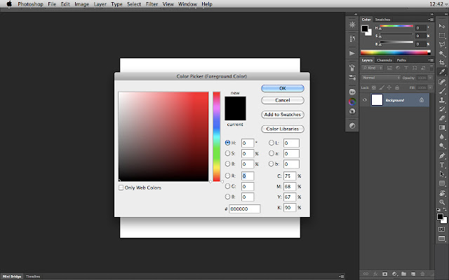
This is the default Color Picker in Photoshop:


In Photoshop CS6 you have now the opportunity to pop up a Color Picker HUD but I still consider this one a little bit tricky and not handy because you have to press Ctrl+Alt+Cmd keys. Even though you could on your Wacom Palette assign those keys to any button I still believe this is not the best method for picking up your colors.


Fortunately Photoshop allows us to choose not only one method: Standard Color Picker, RGB/HSB/CMYK Sliders, Swatches or even third party extensions that can do the job.

Let's talk about these last ones and especially three of them: Kuler, Painter Wheel and Coolorus.

The first one, Kuler, is already by default in your Photoshop extensions. You have to select Window>Extensions>Kuler. This will open a basic color wheel with a luminance slider. The advantage  of this color picker is that it can be always available while working and last but not least a really nice feature that helps you building complementary, monochromatic, compound, shades and triad schemes.


The second one, Painter Wheel, was one of my first extension I used. It simply reproduces the Corel Painter color wheel. A circle color wheel with a triangle allows playing with luminosity and saturation. Just great!


The third and last extension is named Coolorus, which is a combination of the two previous ones. So you will have a Corel Painter color wheel with the ability to construct your complementary, triadic, tetradic, etc... schemes. I encourage you to give a try to this one and support his creator.


This is obviously not exhaustive because you can find other third party extensions but I have tried to sum up what I consider the most relevant and useful. Hope this can help you. Enjoy!

ShareThis