Monday, December 31, 2012

Happy New Year!

Wishing you all a great start to the year!

I’m currently spending some time in California, mainly around Los Angeles and San Francisco, taking a short break and gathering inspiration.

I’ll be back next year with fresh updates, new sketches, and more tutorials to share.

See you soon.


Sunday, October 14, 2012

Building a Custom Color Palette in Photoshop and Painter

Today I will try to show you how to build a custom color palette in both Photoshop and Painter.

The utility of such palettes is to quickly build a range of selected colors you will pick up while working on your illustration. A limited number of colors that corresponds to a previously chosen color mood.
That way you will force yourself not electing or not being tempt to pick colors in the default color wheel.

As an example let's say that you want to work on a new concept or an illustration of a landscape and you decided to use a picture as a reference color mood. I chose one picture found on Google images. I will use this image to develop the demonstration for both Painter and Photoshop.

This is the reference picture:


I will start with Painter which is much more efficient than Photoshop to do that.
The process is very simple.

1- Open your reference picture in a new document

2- Open your Color Set Libraries Window


3- Click on the right upper icon that will open the option menu


4- Click on New Color Set from Image


It's done! You have now a New Color Set saved in you palette that you can order by Hue, Saturation and Value.


You can order your colors by Hue, Saturation and Value.


Unfortunately this is not so easy in Photoshop. Not very complicated but you will have to go through a couple of settings to achieve the same result.

1- Open your reference picture in a New Document in Photoshop

2- Go to Image > Mode > Indexed Colors (Photoshop will automatically reduce the number of colors of your picture to 256, change this number if you want more or fewer colors)


3- Now go to Image > Mode > Color Table (Photoshop will now construct 256 color swatches based on your picture)


4- Save your New Color Swatches


5- Open your Swatches Window


6- Select Replace Swatches and open you previously saved Swatches file


You now have your color in a new Palette but unfortunately you cannot automatically order the colors, you will have to do it manually in the Preset Manager.


So Painter seems to do the job in a couple of clicks while Photoshop needs more. 
Plus the possibility to auto sort the colors in Painter by Hue, Saturation and Value allows me to conclude that Painter is more efficient than Photoshop on constructing Custom Color Palettes.

Saturday, October 13, 2012

Masterclass at CFSL Workshop – Paris

Here are a few photos from my recent Masterclass at the CFSL Workshop in Paris. It was a great experience—so many passionate people eager to learn more about Corel Painter, concept art, and the creative process in general.


It was also a real pleasure to spend time with fellow artists, exchange ideas, and enjoy the atmosphere of the event.


A special thanks to Kness for the fantastic organization and to Serge Birault for his kindness and support throughout the workshop.


Looking forward to the next one.


Saturday, September 29, 2012

Friday, September 28, 2012

Cyberpunk L.A. – Environment Study for CD Projekt Red Art Test


This piece is an environment design study I created as part of an art test for an Art Lead position at CD Projekt Red.

The brief was to envision a cyberpunk version of Los Angeles, blending the city’s recognizable urban sprawl with a layered, high-tech dystopian atmosphere. I focused on contrasts—neon and grime, architecture and chaos, to capture the tone and density you’d expect in a futuristic L.A.

Beyond the visuals, the test was also about conveying narrative potential and spatial logic, both key to world-building at this level.

While it was a test piece, I really enjoyed diving into this challenge and building something that balanced storytelling, design structure, and mood.

Thursday, September 20, 2012

'Sexy Orc'


I finally decided to stop working on this illustration, which had been sitting unfinished for quite a while. As much as I’d still like to make changes, I’ve chosen to leave it as it is. Sometimes it’s better to move forward than to keep chasing a version that might never feel “done.”

The piece was mainly created in Corel Painter, with some final color adjustments in Photoshop.

Hope you enjoy it.

Sunday, September 16, 2012

ZBrush - Brush Size and Wacom Touch Strip

Another trick today. Something that I really believe could save a lot of time and optimize your workflow when you are working with ZBrush.

The brush size is by default set on one hotkey: S. This opens a slider that you can move from left to right to set your brush size. Another way to do it is to press the space bar in order to open the mini interface that allows to manage a couple of settings, brush size included. Handy but not perfect in my humble opinion.

Default Brush Size Hotkey: S


Maybe it is because I am really used to change quickly the size of my brushes in Painter and Photoshop with the touch strip of my Wacom I just need to have the same gestures when I m working on other softwares.

To do this it is very simple. First install this Brush-Up-Down.zsc file in your ZStartup>ZPlugs folder (I found this plug a couple of weeks ago in a ZBrush forum, can't remember where exactly). Basically this little plugin allows to increase and decrease your brush size by 2.
Then when you will open Zbrush you will find it in the Zplugin>Misc Utilities menu. Just set a hotkey for the decrease size button and the increase size button. To do this you will have to Cmd+Alt (Ctrl+Alt on PC) click the button and then assign any shortcut (I used , and ; because I have an french Azerty keyboard on my Mac)


Then go to your Wacom Tablet Preferences and assign your new hotkeys to the touch strip.


Enjoy, and if you have any questions feel free to leave a comment here. :)

Saturday, September 8, 2012

Photoshop and Symmetry. Opposite directions...

We all know that Photoshop is a great tool, and even if some digital artists work mainly with other programs like Corel Painter there will always be a moment when you need Photoshop.
Painting, scaling, adjusting, deforming, warping, enhancing, optimizing, etc... you almost can do whatever you want with Photoshop. Almost...

There is apparently something that Adobe don't want to develop, a tool so useful that could change our everyday work with Photoshop, a tool that is already implemented in so many other softwares: Artrage, Corel Painter, Sketchbook Pro and even Alchemy... The symmetry tool!
I still don't understand why there is no such a useful feature in Photoshop. 


But is there any way to do it? Can't we use a script or any kind of trick to simulate these real time symmetry tools you can find in Painter or Sketchbook for example. Unfortunately the answer is no. Nothing that will look the same or work identically. 

The first method we all tend to use when we work in Photoshop is to draw first half of the drawing on a layer then duplicate it (Ctrl+J/Cmd+J), then flip horizontally this second layer. And repeat this action as many times as necessary. Most of Photoshop users do this.
Of course we can script this action to make it less repetitive but we will always have to, at least, reposition the new layer.

Duplicate first layer. Flip horizontal.


Another method, more creative, consists of creating a Smart Object from your initial layer, then duplicate this smart object and flip it horizontally.
When you double click on your first Smart Object it will open a second Photoshop document (.psb file). Organize and arrange your windows with a horizontal tiling in order two see what you draw in your instance (.psb file) and the result in your main document (.psd file). Unfortunately this instance is not updated automatically and you will have to save (Ctrl+S/Cmd+S) whenever you want to see the result. So it is quite good but not perfect.

Transform your layer in Smart Object, duplicate it and flip horizontally.

Double Click on your Smart Object Layer.
Arrange windows to show your master document and your Smart Object.
Draw in your smart object and save to update your master document.


So, that's it? Nothing else, better or optimized in Photoshop?
Well to be honest I tried another method but this one is definitively very tricky. First of all you need to work with Photoshop Extended version to be able to work with the 3D tools. Then the idea is to create a 3D instance with the 3D Photoshop menu, then create a plane in a 3D Software (3DS Max or Maya for example) then duplicate the first plane and flip it. But this method is highly unresponsive unless you have a NASA computer. Complex and laggy it will not help you working on big documents.

So no miracle or super trick to draw with a real time symmetry tool in Photoshop. Just do it with other software that already allows you to work with X axis, Y axis, custom angle axis, etc... Waiting for the day when Adobe will implement it in Photoshop. :(

Saturday, September 1, 2012

About Color Picking in Photoshop

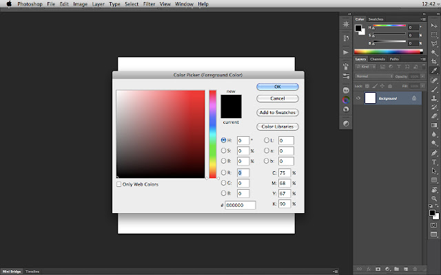
I have been asked many times how I manage colors in Photoshop and mainly how I pick them using the tools available in this software. To be honest I have never been a huge fan of Photoshop Color Picker.
First of all because I find really annoying to open this window (even though there is a F6 shortcut) that interrupts the workflow. Second because I am maybe really used to work with the Corel Painter Color Picker that I consider optimal.

This is the default Color Picker in Photoshop:


In Photoshop CS6 you have now the opportunity to pop up a Color Picker HUD but I still consider this one a little bit tricky and not handy because you have to press Ctrl+Alt+Cmd keys. Even though you could on your Wacom Palette assign those keys to any button I still believe this is not the best method for picking up your colors.


Fortunately Photoshop allows us to choose not only one method: Standard Color Picker, RGB/HSB/CMYK Sliders, Swatches or even third party extensions that can do the job.

Let's talk about these last ones and especially three of them: Kuler, Painter Wheel and Coolorus.

The first one, Kuler, is already by default in your Photoshop extensions. You have to select Window>Extensions>Kuler. This will open a basic color wheel with a luminance slider. The advantage  of this color picker is that it can be always available while working and last but not least a really nice feature that helps you building complementary, monochromatic, compound, shades and triad schemes.


The second one, Painter Wheel, was one of my first extension I used. It simply reproduces the Corel Painter color wheel. A circle color wheel with a triangle allows playing with luminosity and saturation. Just great!


The third and last extension is named Coolorus, which is a combination of the two previous ones. So you will have a Corel Painter color wheel with the ability to construct your complementary, triadic, tetradic, etc... schemes. I encourage you to give a try to this one and support his creator.


This is obviously not exhaustive because you can find other third party extensions but I have tried to sum up what I consider the most relevant and useful. Hope this can help you. Enjoy!

Monday, August 27, 2012

Morning Warm-Up – Corel Painter 12


This was a quick morning warm-up done in Corel Painter 12.

Yes, I definitely enjoy drawing and painting women—probably one of the most complex and interesting subjects to explore. The challenge lies in capturing both strength and subtlety, structure and expression.

Always a rewarding exercise.

Thursday, August 23, 2012

Lunchtime Sketch – Testing Photoshop CS6’s 2B Pencil Brush


A quick lunchtime sketch using the 2B Pencil Brush in Photoshop CS6.

The result is a bit on the blurry side, but overall it holds up well—especially for a casual test. From what I can tell, the brush gives its best results when working on larger canvas sizes, where the texture and stroke definition have more room to breathe.

Still, a nice tool to play with when you’re looking for something that mimics traditional pencil with a digital twist

Wednesday, August 1, 2012

Quick Sketch with Sketch Club on iPad


This is a quick sketch I did using the Sketch Club app on iPad.


The feel of this app is surprisingly good, responsive, intuitive, and with enough flexibility to explore without overcomplicating things. For quick studies or casual sketching sessions, it’s a solid tool.


If you’re looking for something lightweight but effective, I highly recommend giving Sketch Club a try.

http://itunes.apple.com/us/app/sketch-club/id404414176?mt=8

Thursday, July 19, 2012

Environment Concept – Post-Apocalyptic New York


Here’s another environment concept, this time aiming for a more realistic style.


The piece was created in Photoshop CS5 and imagines a post-apocalyptic version of New York—a city once full of energy now overtaken by silence, decay, and nature slowly reclaiming the ruins.


I focused on atmosphere and scale, trying to convey a sense of loss without losing the structure and familiarity of the urban landscape. A fun and challenging piece to work on.


Monday, May 28, 2012

A couple of days in Rome

I spent the weekend back in Rome, and as always, the city didn’t disappoint.


It’s still one of those places where every corner feels like a painting, every alley tells a story, and the mix of ancient and modern never gets old. A short visit, but a great one. Always inspiring to walk those streets again.


ShareThis