
Drawn in Rebelle 7, focused on gesture.
#InkDrawing #DigitalSketch #Rebelle7 #PortraitStudy #Brushwork #SimonLocheArt

#InkDrawing #DigitalSketch #Rebelle7 #PortraitStudy #Brushwork #SimonLocheArt
Whether you're a beginner building fundamentals or a seasoned artist refining your craft, the right books can become lifelong companions.
This list includes some of the best art training books out there, full of practical exercises, brilliant teaching, and deep visual insight.

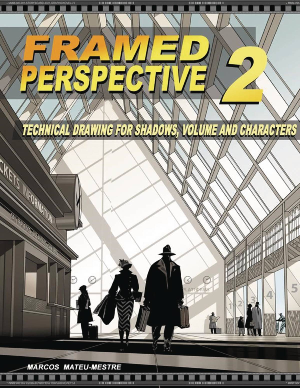
This is a must-have for understanding visual storytelling and composition. It breaks down how to create mood, movement, and clarity in sequential images. Marcos walks you through examples using cinematic lighting, silhouettes, and compositional flow, making this book invaluable for both comic artists and concept designers.

A powerful continuation of the first volume, Framed Ink 2 focuses on advanced narrative techniques, staging, and visual empathy. It explores how to build tension, emotion, and rhythm visually, essential concepts for those working in story-driven media like games, film, or animation.

A visually rich and clearly written book focused on how light interacts with form and how to use color intentionally. Charlie Pickard breaks down key concepts like atmospheric perspective, lighting direction, and hue shifts. Perfect for digital painters who want to improve lighting and storytelling.

These two volumes go deep into the mechanics of perspective drawing. Volume 1 covers the essentials: 1, 2, and 3-point perspective, horizon lines, and vanishing points. Volume 2 builds on that, focusing on how perspective can be used emotionally in storytelling. These books are foundational for anyone serious about environment design and believable space.

A self-published legend. Peter Han's Dynamic Bible is a workbook filled with exercises that develop your visual library, line confidence, and design logic. With a focus on building strong drawing habits and shape design, it’s ideal for artists looking to sharpen their fundamentals and take on concept sketching or creature design.

Full of simplified and dynamic breakdowns, this book is great for learning how to exaggerate form while keeping things grounded. It covers stylized anatomy, facial expressions, and poses with a clear and playful visual language. Perfect for artists looking to inject personality into their character work.

A brilliant guide for understanding anatomy in a stylized yet structural way. Rockhe Kim explains human anatomy through a designer's lens, breaking down muscle groups into clean, readable forms. Great for character designers, figure drawing students, or anyone trying to draw believable human bodies with a stylized edge.

An elegant, in-depth guide to practical perspective for illustrators and concept artists. Dongho Kim explains how to visualize space intuitively, making this book ideal for both beginners and seasoned environment artists. Beautifully laid out and highly digestible.
.jpg)
A fresh and accessible anatomy book that connects gesture, construction, and surface anatomy. Tom Fox includes detailed studies, pose breakdowns, and insightful notes that help you understand the figure in motion. It’s a great companion for daily sketchers and character-focused artists alike.
These books aren't just pretty to flip through, they're powerful learning tools.
Whether you're leveling up your gesture drawing, mastering perspective, or understanding light and color, there's something in this list to help push your skills further.
#ArtBooks #DrawingTips #ConceptArtTraining #FundamentalsMatter #SimonLocheArt

As artists, we often get caught up in the excitement of color, detail, and brushwork. But when it comes to building a truly compelling composition, sometimes less is more. That’s where Notan comes in, a deceptively simple concept that can transform the way you design your paintings.
Notan (濃淡) is a Japanese word that translates to “light-dark.” It’s all about the relationship between positive and negative space, between areas of light and areas of dark. Think of it like the visual skeleton of your artwork. Strip away the color, the detail, even the subject, and what you’re left with is the pure structure of your composition.
Ever stare at a painting that just feels off, but you can’t quite figure out why? Or maybe you’re planning a new piece and something in the layout doesn’t feel balanced? Notan studies help you see the design clearly, without distractions.
By reducing your scene to only two or three values (usually black, white, and maybe a midtone), you can spot compositional issues early. Is the focal point clear? Are the shapes too similar in size? Is the negative space doing any heavy lifting? These are the kinds of questions Notan helps answer.
You don’t need any fancy tools to get started. You can:
Use black markers or paint on white paper
Snap a photo and simplify it digitally into black and white shapes
Sketch with just one value on your tablet
The key is to stop worrying about realism and focus on clarity, contrast, and balance between shapes.
Here’s a great tip: Try shifting your viewpoint or cropping your scene differently. Even a small change in perspective can completely transform the Notan, and in turn, the strength of your final piece.
While Notan is often taught in art schools, it’s a tool that professional artists keep coming back to. Whether you’re working in oils, watercolors, or digital, it’s a fast and effective way to test the strength of your ideas before you commit hours of work.
Adding a third value, usually a midtone, can also be helpful. This allows for more nuance and helps guide decisions about lighting and depth later on in your painting.
Think of Notan like stretching before a workout. It doesn’t take long, but it sets the stage for everything that follows. Try making it a part of your process. Do quick studies before starting a new piece. Use them to test thumbnails or resolve tricky compositions.
You’ll be amazed at how much it sharpens your design instincts and how it helps you see your own work with fresh eyes.

In a world full of noise and color, Notan brings you back to the essentials. It’s a reminder that great art starts with great design. Light and dark. Positive and negative. Simplicity with purpose.
So the next time you’re stuck, grab a pen or open a new canvas, and block in the big shapes. Sometimes, all it takes is two values to bring clarity and power to your vision.
Tools to help you organise values:
- Photoshop
- Proko Value Tool
Related Articles:
Leg Day for Artists: Why Focusing on One Skill at a Time Builds Real Strength
Quick digital paint. 3 values study
#Notan #ArtComposition #VisualDesign #ArtistTips #ArtStudy #CreativeProcess #PaintingTips #DesignThinking #ValueStudy #ArtEducation #MakeArtDaily #SketchSmart #ArtFundamentals #DigitalPainting #TraditionalArt #SimonLocheArt

As artists, we constantly talk about the importance of values, and for good reason.
Value structure (the contrast between lights and darks) is one of the most powerful tools for readability, composition, and mood. But seeing values clearly isn't always easy, especially when working in color.
That’s where See Value comes in. This small but brilliant app does one thing, and does it extremely well: it helps you see the values in your reference or artwork instantly.


See Value is a mobile app that overlays a value filter over your camera or photo gallery. You can use it in real time or on imported images to instantly understand the light/dark relationships in your reference.
It’s perfect for:
Studying photo references
Capturing plein air scenes with better value awareness
Checking your own digital or traditional work for value grouping issues
Understanding why something feels "off" in a painting
In digital painting software, it’s easy to toggle a grayscale filter. But when you're out in the world, or working traditionally, that option vanishes.
See Value brings that tool into the physical world, letting you:
Instantly check value balance in real scenes or photos
Train your eye to group values more effectively
Compare different references quickly without second-guessing
I often use See Value when scouting references or setting up a sketch from life. A quick check through the app tells me what to emphasize, what to simplify, and where my focal areas could land. It’s especially helpful when the lighting is soft or complex.
It’s also a great tool to show students when explaining why certain areas of a composition work or don’t.
See Value is a tiny tool with a big impact. It won’t make your painting for you, but it will train your eye and boost your awareness of one of the most foundational aspects of visual storytelling.
Highly recommended for any artist who wants to improve their value structure, whether you're painting, drawing, or simply observing.
See Value in the app store (FREE): https://apps.apple.com/in/app/see-value/id1312532225

#SeeValue #ArtTools #ValueStudy #ArtProcess #VisualClarity #SimonLocheArt

That ambition is good, but it can also be what holds you back.
Think of it like training at the gym. You wouldn’t try to do leg day, chest day, cardio, and flexibility all at the same time. You isolate. You focus. You build strength, one area at a time.
The same applies to your art practice.
Trying to improve everything at once usually leads to frustration and burnout. Instead, isolate one aspect of your craft, and dedicate a session or even a full week to it.
Want to improve your composition?
Grab a marker or a single soft pencil.
Set a timer for 10-15 minutes.
Fill a page with thumbnails. Don't worry about detail or finish, just focus on flow, balance, and rhythm.

Want to improve color composition?
Trace a portrait or photo, if you need a quick composition (yes, tracing is fine when you're focusing on something else).
Then dive into color. Focus on getting the temperature, harmony, and contrast right.
Ignore rendering. Ignore linework. Just push paint around.
 Here, I just grabbed my iPad and directly painted with colors, not caring about accuracy
Want to sharpen your anatomy?
Do 30-second gesture drawings with a timer.
Spend a whole sketch session just drawing hands. Or shoulders. Or feet.

Want to get better at lighting?
Take a simple bust model or head sketch and draw it under five different lighting scenarios.
Stick to grayscale. Don't distract yourself with color.

Want to work on materials and surfaces?
Paint studies of just metal. Then just skin. Then just fabric.
Don't worry about the character. You're just learning how each material reacts to light.
Focusing on a single area forces you to solve problems more deeply. It removes the noise and lets you listen to the part of the process you're trying to train. Like doing slow reps at the gym, you're building muscle memory and confidence where it counts.
Even professionals train like this. Behind every "polished" piece are dozens of focused studies: hands, rocks, values, brushstrokes.
So next time you sit down to draw, ask yourself: What's today’s leg day?
#ArtPractice #FocusedTraining #ArtistTips #ConceptArt #SketchbookDiscipline #NotanStudies #SimonLocheArt

Inking is one of the most rewarding parts of the drawing process, and also one of the most unforgiving. There’s no undo, no erasing, no backtracking. But that’s what makes it powerful. Ink rewards bold decisions, controlled rhythm, and a sensitivity to surface and stroke.
Here are a few essential ink drawing tips to help you build more confidence, clarity, and expression in your work:
1. Vary Your Line Weight
Think of line weight as a way to guide the viewer’s eye. Use thicker lines to emphasize structure, form, and objects in the foreground. Use thinner lines for detail, texture, and elements that are farther away.
The contrast between thick and thin adds visual interest and helps separate planes, even without any shading.
2. Use Your Whole Arm, Not Just Your Wrist
For long, flowing strokes, engage your shoulder and elbow, not just your wrist. This gives you smoother curves and more confident lines. Before starting a drawing, warm up with quick, loose gestures, 10 big curves or ellipses with no stopping.
The more you move your arm, the more energy and fluidity your lines will have.
3. Let the Paper Add Texture
Don’t fight your surface. Work with the texture of the paper by varying the pressure of your strokes. Let the brush or pen skip and break a little, especially for rough textures, shadows, or organic surfaces. These subtle imperfections add character.
A heavy press gives you solid blacks. A lighter touch lets the paper show through, giving your work atmosphere and grit.
4. Embrace Imperfection
Ink is about decision-making, not perfection. If a line wobbles or breaks unexpectedly, use it. Fold it into the drawing. Sometimes the best part of an ink drawing is the mistake you didn’t try to fix.
5. Commit to the Line
Hesitation shows. Commit to each stroke with purpose, even if it’s not 100% right. Confident lines, even if slightly off, are often more appealing than over-cautious ones.
If unsure, lightly pencil your structure first, then ink with clarity.
Inking isn’t just about control; it’s about rhythm, sensitivity, and letting go of perfectionism. Like all skills, it comes with mileage. So grab your favorite brush pen, turn off the pressure to be perfect, and let the ink flow.
#InkDrawing #DrawingTips #LineWeight #BrushControl #TraditionalArt #SimonLocheArt


Understanding the reality of concept art helps both aspiring artists and curious outsiders appreciate the depth of the discipline. It’s not just art, it’s design, communication, and collaboration in motion. Debunking these myths brings us closer to seeing concept artists for what they really are: visual problem solvers working at the heart of production.
#ConceptArt #GameArt #ArtIndustry #VisualDevelopment #DigitalArt #ArtCareer #ConceptArtistLife #ArtEducation #CreativeProcess #SketchbookWork #SimonLocheArt