Sunday, February 16, 2025

Quick digital paint. 3 values study.


When it comes to sharpening your artistic fundamentals, few exercises are as effective, and as deceptively simple, as a 3 values study. This quick digital painting was done using Infinite Painter, and it’s part of a series of value exercises I return to regularly to maintain clarity in my compositions.


Why 3 Values?

The core idea is straightforward: limit yourself to just three tones; light, mid, and dark. This forces you to simplify forms, focus on readability, and make conscious decisions about where to place contrast. Without the full spectrum of colors and gradients, you’re left with the essentials: composition, shape, and light logic.

Reducing an image to only three values is an incredible way to improve your ability to group elements and create depth and focus. It also helps to avoid over-rendering and teaches you how to guide the viewer’s eye through strategic contrast.

Why Use Infinite Painter?

I chose Infinite Painter for this study because it offers a minimal yet powerful setup for quick sketches and controlled experiments. Its brush engine and layer control make it easy to block in values, test variations, and refine shapes, all while staying in the flow of creation.


Tips if You Want to Try This Yourself:
Start with a simple silhouette and build your composition from large shapes first.
Use a mid-value background to give yourself room to push light and dark.
Avoid small details, focus on defining the image through shape and contrast.
Keep it quick. 15–30 minutes is enough to get real value (pun intended) out of the exercise.


This kind of study doesn’t take long but consistently helps me refine my visual thinking. It’s also a great warm-up or break from longer, more detailed pieces.

If you haven’t tried a 3-values study in a while, or ever. I highly recommend giving it a go. You’ll be surprised how much clarity it brings to your overall painting approach.

#3ValuesStudy #DigitalArt #InfinitePainter #ArtFundamentals


Link: Infinite Painter.


Sunday, February 2, 2025

Candy Solitaire Launches February 6th!

Candy Solitaire launches February 6th! A fresh and colorful take on the classic game, created by the talented team at New Games. Get ready for a fun new challenge.

The cat is out of the bag! I’m thrilled to share that Candy Solitaire is officially launching on February 6th. Huge congratulations to the incredible team at New Games (proud to work in this department) for all their hard work in bringing a fun, vibrant twist to a time-tested classic.

This game is a celebration of creativity, combining the charm of a beloved format with a bold, colorful new look. If you enjoy clever challenges and bright, feel-good design, you won’t want to miss it.

Mark your calendars, this one is going to be sweet.

Trailer:


#CandySolitaire #GameLaunch #ComingSoon #NewGames

Tuesday, January 14, 2025

Late Afternoon Sketch – Aubrey Beardsley Tribute


This is a late afternoon sketch I made of Aubrey Beardsley, the brilliant and short-lived 19th-century illustrator whose work continues to inspire me. His sharp lines, bold contrasts, and striking compositions have always stood out as something unique, timeless in their graphic clarity.


I drew this using Infinite Painter, trying to keep the process simple and direct. No elaborate setup, just a quick session focused on capturing the elegance and eccentricity that defined Beardsley’s visual language.


Even in a short sketch, something is rewarding about spending time with the work of artists who came before, absorbing their choices, their rhythms, and letting some of that filter into your own practice.


Monday, January 6, 2025

Why I Use Shotdeck for My References


When it comes to building a strong library of visual references, Shotdeck has become one of my go-to resources.
Whether I’m looking for mood, lighting, composition ideas, or just fresh inspiration, it’s a tool that saves time and consistently delivers.

Shotdeck offers a curated collection of high-quality frames pulled from a wide range of films. What makes it so useful isn’t just the quality of the images, but the way everything is categorized, you can search by color palette, mood, composition type, time of day, genre, or even specific visual themes.

As someone who works across both illustration and concept art, having quick access to frames that have already mastered color balance, staging, and atmosphere is incredibly valuable. It’s not about copying, it’s about learning. Analyzing a great frame gives you practical insight into how professionals structure an image and guide the viewer’s eye.
I often use Shotdeck when preparing moodboards, studying lighting scenarios, or warming up with quick composition sketches. It’s efficient, inspiring, and constantly growing, which means you’re never short on new material to learn from.

If you’re serious about improving your sense of composition, color, or visual storytelling, I highly recommend checking it out. -> https://shotdeck.com

#Shotdeck #ArtReference #VisualStorytelling #ConceptArt #SimonLocheArt

Saturday, January 4, 2025

✏️ Step-by-Step Pencil Portrait Tutorial: Master Realistic Drawing!

Drawing realistic portraits can seem intimidating, but with the right approach and a bit of guidance, it becomes a process you can enjoy and grow through.
I’ve just shared a new YouTube tutorial where I walk you through a step-by-step pencil portrait using Infinite Painter as my tool of choice.


Whether you’re just starting out or already comfortable with sketching, this tutorial is designed to help you build solid fundamentals, understand structure, and practice rendering with confidence.


Why Infinite Painter?

Though this is a pencil-style drawing, the tutorial is done entirely in Infinite Painter, an intuitive and powerful app that mimics the feel of traditional tools. Its brush response, simplicity, and ability to replicate the texture of graphite make it a great choice for both digital and traditional artists.
However you can use whatever digital or traditional technique you're comfortable with.


Who Is This For?

This tutorial is ideal for:
Beginners looking to learn portrait drawing in a step-by-step way
Traditional artists curious about transitioning to digital tools
Digital sketchers who want to push their realism and accuracy
Anyone who wants to draw along and build confidence


Watch the Full Timelapse

If you’ve ever wanted to create portraits that feel lifelike and grounded, this is a great place to start or deepen your practice.

Thursday, January 2, 2025

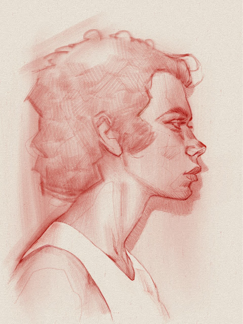
Profile Portrait – Created in Infinite Painter


This is a profile portrait I created on iPad using Infinite Painter, based on a reference photo and sketched with a red old pencil brush. I wanted to keep it simple while exploring texture and line flow, and this brush has just the right feel for that, soft, tactile, and a bit unpredictable in the best way.


Infinite Painter continues to impress with how well it replicates natural media like pencils, oils, gouache, and watercolor. The control it offers over paper texture, depth, and brush behavior makes it one of my go-to tools for digital sketching and painting.


Highly recommend checking it out if you’re after that traditional feel in a digital space.


#DigitalArt #InfinitePainter #iPadArt


Sunday, December 29, 2024

New Year’s Resolution: Reorganizing the Studio for a Creative 2025

art studio reorganization, setting up a creative workspace, artist new year resolutions, digital art ergonomics, how to organize your art studio, 2025 creative goals

As the year winds down, I decided to take some time to reorganise my studio space. It’s something I’d been putting off for a while, but it felt like the right moment to reset and prepare for what’s ahead.

The goal was simple: to create a more comfortable, functional environment that supports my workflow and encourages me to make even more art in 2025. I cleared out unused materials, rearranged some furniture, and tried to open up the space both physically and mentally.

There’s still plenty to improve, especially when it comes to my digital art station. My current table and chair setup is... let’s just say "less than ergonomic." That’s going to be the next big upgrade. 

Still, even with a few pieces of the puzzle left to finish, the space already feels different. Hopefully, this fresh start will help fuel new ideas.

art studio reorganization, setting up a creative workspace, artist new year resolutions, digital art ergonomics, how to organize your art studio, 2025 creative goals

#ArtStudio #NewYearsResolution #CreativeWorkspace #StudioReorganization #DigitalArtSetup #SimonLocheArt #ArtistLife

Friday, December 27, 2024

Quick Photoshop Tip – Rule of Thirds Grid Made Easy

 If you’ve ever wanted a fast, built-in way to apply the Rule of Thirds in your Photoshop compositions, without manually overlaying a reference image, this quick tip is for you.

It takes just a few seconds to set up and works every time you toggle your grid. Here’s how:

How to Set Up a Rule of Thirds Grid in Photoshop:

  1. Go to Preferences > Guides, Grids & Slices.

  2. Set Gridline Every to 100%.

  3. Set Subdivisions to 3.

  4. To display the grid, go to View > Show > Grid or use the shortcut Ctrl+` (PC) or Cmd+` (Mac).


That’s it. Now, each time you toggle the grid, you’ll get a clean, non-invasive Rule of Thirds overlay, perfect for checking your focal points, composition balance, and visual flow.

This setup works especially well for quick layout adjustments, thumbnails, or even more polished pieces where you want to double-check your compositional anchors.


Let me know if this was useful, or if you’d like more Photoshop workflow tips like this. Always happy to share!

Wednesday, December 25, 2024

Infinite Painter - Sketch from Photo Reference


Infinite Painter - Sketch from Photo Reference

Monday, December 2, 2024

19th-Century Inspiration: The Spanish Artists Who Shaped My Creativity

19th-century artists, artists who inspire, Spanish painters of the 19th century, French art history, artist influences, Sorolla inspiration, Ramon Casas art, Aureliano de Beruete painter


I’ve always been fascinated by 19th-century artists, especially those working in the latter half of the century, during a time of dramatic societal, cultural, and artistic change. This was the period that bridged the traditional with the modern, and many of the ideas, techniques, and movements born then still echo in the work we do today.

As a French artist, I’ve always felt a deep connection to the French artistic landscape of that era. France was the epicenter of innovation, from academic painting to the birth of Impressionism and beyond. It was a time of experimentation, rebellion, and redefining beauty.

But after living in Spain for over 15 years, I’ve come to appreciate another side of that history: the powerful, distinct contributions of Spanish artists from the same era. Their approach to light, portraiture, and everyday life carries an expressive honesty that resonates with me deeply.

It’s difficult to choose which artists have influenced me the most, but if I had to name three who have had a lasting impact on my work and artistic perspective, it would be:

  • Joaquín Sorolla — for his extraordinary handling of light and movement, especially in outdoor scenes.

  • Ramon Casas — for his expressive linework, elegance, and understanding of character.

  • Aureliano de Beruete — for his ability to capture landscapes with emotional depth and subtle atmosphere.

These artists have reminded me to look beyond the surface, to embrace immediacy and gesture, and to ground technical skill in lived experience and light.

What about you? Which artists, from the 19th century or beyond, have left a mark on your creative path?

#ArtHistory #19thCenturyArt #Sorolla #RamonCasas #AurelianoDeBeruete #ArtistInspiration #SimonLocheArt

ShareThis